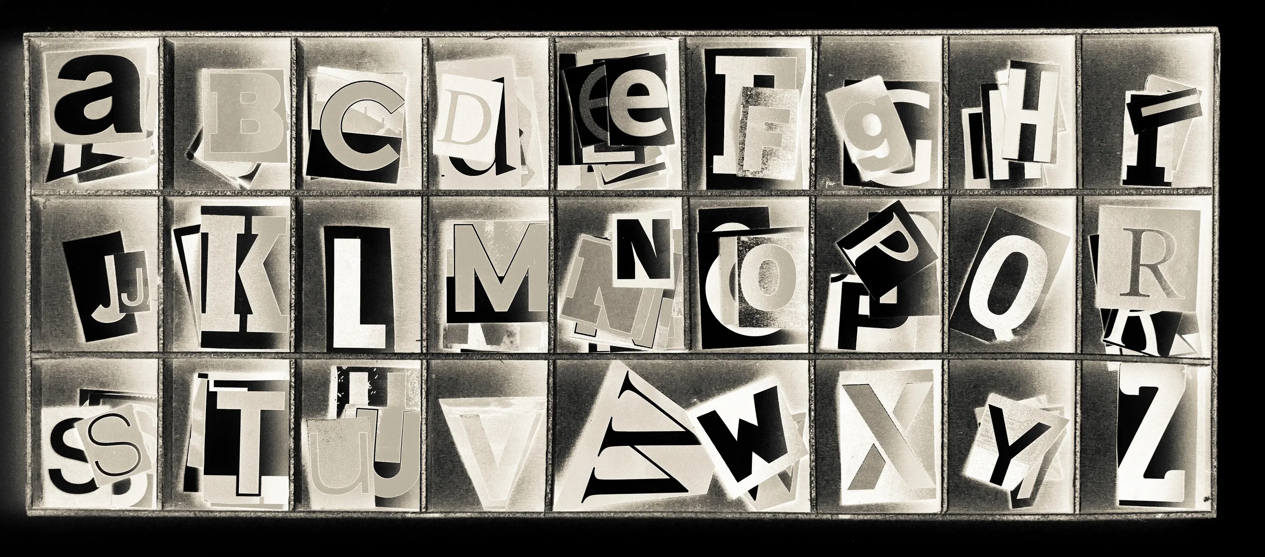
Why your Fonts Matter
Let me tell you about something I noticed last week.
I was scrolling through therapist websites—you know, the way you do when you're helping a friend find someone to talk to. And I stopped cold on one site. Beautiful photos. Thoughtful copy. Services that seemed perfect.
But the logo? Comic Sans. Or something eerily close to it.
My brain did that thing where it just... recoils. Not because the therapist wasn't qualified. Not because their approach wasn't sound. But because something deep in my subconscious screamed: This doesn't feel safe.
And here's the thing that keeps me up at night: that therapist has no idea. They have no idea how many people landed on their site, felt that same uncomfortable flutter, and quietly clicked away. No nasty review. No complaint. Just... gone.
Fonts speak before your words do.
The Silent Conversation Happening on Your Website
You've spent years building your expertise. You care deeply about your clients. You probably agonized over every word on your "About" page, making sure people understood your approach, your values, your heart for this work.
But before anyone reads a single word of that carefully crafted copy, their brain is having an entirely different conversation with your typography.
It's brutal how fast this happens. Researchers say it takes about 50 milliseconds—one-twentieth of a second—for someone to form an opinion about your website. Your fonts are part of that snap judgment. They're whispering things about you that you might not even intend to say.
When I see a therapist's website with a cartoon-style font, my brain translates that as: Maybe they're not serious about this. When I see a holistic wellness coach using a stiff, corporate typeface, I think: Will they actually understand me, or is this going to feel clinical and cold?
Neither of these judgments is fair. Neither is probably true. But they happen anyway, beneath the surface of conscious thought, shaping whether someone decides to trust you with something as vulnerable as their health or healing.
What Your Fonts Are Accidentally Saying About You
Every typeface carries emotional weight. It's kind of wild when you think about it—these little shapes on a screen, and yet they communicate so much.
Too decorative, too scripty, too trendy: These fonts can feel like they're trying too hard. Or worse, like you don't understand the seriousness of what you do. I'm talking about those swirly script fonts that might work beautifully on a wedding invitation but make someone seeking mental health support think, Is this person going to take my anxiety seriously?
Too stiff, too corporate, too rigid: On the flip side, fonts that feel like they belong in a law firm can create a different problem. They whisper: sterile, impersonal, just another number in the system. When someone's looking for a therapist or a wellness practitioner, they're often looking for warmth alongside professionalism. They want capable and caring.
Balanced, intentional, and human: These are the fonts that get it right. They feel calm without being boring. Professional without being cold. Modern without being trendy. They make people exhale a little. They say: You're in good hands.
Your website isn't just a digital brochure. For many people, it's the first moment they're allowing themselves to imagine getting help. The typography needs to hold that moment gently.
Let's Talk About Accessibility (Because It's Actually About Respect)
Here's something I wish more people understood: readability isn't a nice-to-have feature. It's an act of care.
Think about who's visiting your website. Maybe it's someone in their sixties squinting at a phone screen, trying to find a physical therapist for their back pain. Maybe it's a parent with a migraine, desperately searching for a pediatrician who has evening hours. Maybe it's someone with dyslexia or a vision impairment, already navigating the world with extra effort, now trying to figure out if you're the right fit.
When your fonts are hard to read—too small, too light, too fancy—you're accidentally putting up a barrier. You're making people work harder at the exact moment they might already feel exhausted.
Good typography choices mean:
Letter shapes that are distinct and clear, so "I" and "l" and "1" don't all blur together
Strong contrast, because pale gray text on a white background makes people strain their eyes (and then leave)
Comfortable spacing and size, so reading doesn't feel like a chore
Navigation text that's actually legible, not some tiny uppercase sans-serif squeezed into a header
When someone can easily read your website, they feel respected. They feel like you thought about them. And that feeling—that's the beginning of trust.
What Actually Works (And Why)
Okay, so if cartoon fonts are out and intimidating corporate fonts are questionable, what should you use?
The goal is to feel both human and professional at the same time. Not an easy balance, but totally achievable. Here are some combinations I've seen work beautifully:
The Modern Warmth Approach
Headings: Poppins, Lato, or Montserrat
Body text: Merriweather or Georgia
This pairing feels current without feeling cold. The sans-serif headings keep things clean and organized, while the gentle serif body text adds warmth and credibility. I see this a lot on counseling center websites, and it just works.
The Approachable Professional
Headings: Nunito or Source Sans 3
Body text: Open Sans
Perfect for coaches, therapists, and holistic wellness practitioners. These fonts have slightly rounded edges that feel friendly without tipping into cutesy. They say: I'm qualified, but I'm also someone you could actually talk to.
The Clean Clinical Look
Headings: Inter or Roboto
Body text: Inter, Roboto, or Noto Sans
For medical clinics, urgent care, or multi-disciplinary practices where clarity is paramount. These fonts don't mess around. They're straightforward, highly readable, and they communicate competence. Just make sure the rest of your design adds some warmth, or it can skew too sterile.
The Rules I Wish Everyone Followed
You don't need to be a designer to get typography right. You just need to care about the experience you're creating. Here are the guidelines I'd put on a Post-it note if I could hand one to every healthcare or wellness professional:
Two font families maximum. Any more and your site starts to feel chaotic.
Body text should be at least 16px on desktop. Bigger is often better. People shouldn't have to zoom in.
Avoid light gray text on white backgrounds. I know it looks "clean," but it's a nightmare to read. Go darker.
Script fonts are for accents only. A small quote, maybe. Your entire tagline? No.
Test your site on your phone, not just your big monitor. Most people will see it on a small screen first.
Your Website Meets People Before You Do
I keep coming back to that therapist with the cartoon font. I wonder how many people they could have helped. I wonder how many conversations never happened because of a design choice they probably made in five minutes, years ago, without realizing the weight it carried.
Your website is often the first handshake. The first eye contact. The first moment someone decides whether this might be the place they finally ask for help.
Thoughtful typography tells them: You're in the right place. You'll be understood here. This space is safe.
If your current fonts don't match the level of care you provide in person, if they don't reflect the professionalism and warmth you bring to your work, it might be time for a refresh. Sometimes a few small changes—a different typeface, slightly larger text, better contrast—can completely reshape how confident and comfortable your visitors feel.
Because they're not just looking at fonts.
They're deciding whether to trust you.
And that decision? It starts the second they land on your site.
Is your website's typography working for you or against you? If you're not sure, take a look at it on your phone right now. Read it like you're someone who's never met you. What does it whisper about who you are?